Hanwha Corporation E&C Division CI
The Hanwha tri-circle consists of three circles which expand, develop, and evolve into the universe
through continuous change and innovation and is the symbol of Hanwha Corporation E&C Division
It contributes to the harmonious development of customers, society and humanity,
and expresses the development of a world-class company.
CI Concept
Hanwha’s three signature orange hued tones are dynamically integrated
into the Hanwha tri-circle. The tri-circle also serves as the standard for the uniform
expression of Hanwha as a core design element that creates a visualization
of Hanwha’s identity.
- Composition
-
Change and
Innovation -
Consists of three circles infinitely evolving, developing,
and expanding through constant innovation and change.
- Meaning
-
Creative
encounter -
Hanwha’s core values, vision, and three business sectors are
depicted in the creative merging of the three circles. The symbol
also portrays our growth as a world-class company dedicated to
investments in the future for our clients, society, and humankind.
- Expression
-
Dynamic
energy -
Harmoniously moving as one, the energy of motion from the
three circles expands outward, representing infinite growth.
Signature
The signatures are to be defined as the symbols and logos designed with specific
standards for maintaining the corporate brand and image.
The signatures are not to be tampered with or deformed under any circumstances. The digital files are intended to be used in their original forms.
Korean Logo Type
English Logo Type
Color Scheme
The signature color uses Hanwha Orange as the medium for color expression.
As a rule it should be used on a white background and is to be defined by Process
Color(CMYK).
When used for newspaper, magazine ads, other colored prints, or other off-set prints, adhere to Process Color.
For other mediums such as TV ads, websites, or broadcasting, RGB color is to be used.
-
1
Hanwha Orange
100%
RGB 243 / 115 / 33
CMYK 0 / 68 / 100 / 0 -
2
Hanwha Orange
70%
RGB 248 / 155 / 108
CMYK 0 / 47 / 70 / 0 -
3
Hanwha Orange
50%
RGB 251 / 181 / 132
CMYK 0 / 34 / 50 / 0 -
4
Process Black
K 100
FORENA BI
Hanwha’s construction brand FORENA means “connection” in Swedish, and it embodies
our determination to create a new living culture through connecting people and space.
Brand Mark
FORENA’s brand mark is designed as a wordmark type with grace and a minimalistic
style to represent our brand philosophy of “Completion of life”.
The simple Serif font symbolizes Connection, the meaning of FORENA.
Preferred Usage
Alternate Usage
FORENA Color System
FORENA blue delivers sophisticated and serene beauty through the harmony
of black, the color of charisma, and blue, the color of trust.
Additionally, FORENA’s champagne gold, silver, grey, and black & white color scheme depicts the distinctive
refined style of FORENA.
Primary Color
-
FORENA BLUE
PANTONE 540 CRGB 0 / 48 / 87
HEX / HTML 003057
CMYK 100 / 57 / 12 / 66
Secondary Colors
-
FORENA CHAMPAGNE GOLD
PANTONE 8003 CRGB 139 / 128 / 117
HEX / HTML 8B8075
CMYK 42 / 41 / 47 / 26 -
FORENA GOLD
PANTONE 876 CRGB 139 / 99 / 75
HEX / HTML 8B634B
CMYK 0 / 41 / 53 / 42 -
FORENA SILVER
PANTONE 877 CRGB 138 / 141 / 143
HEX / HTML 8A8D8F
CMYK 45 / 34 / 34 / 0 -
FORENA GRAY
PANTONE COOL GRAY 11 CRGB 92 / 92 / 92
HEX / HTML 5C5C5C
CMYK 0 / 0 / 0 / 80 -
BLACK
RGB 0 / 0 / 0
HEX / HTML 000000
CMYK 0 / 0 / 0 / 100 -
WHITE
RGB 255 / 255 / 255
HEX / HTML FFFFFF
CMYK 0 / 0 / 0 / 0
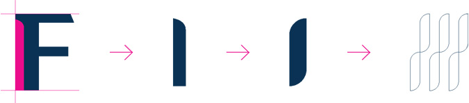
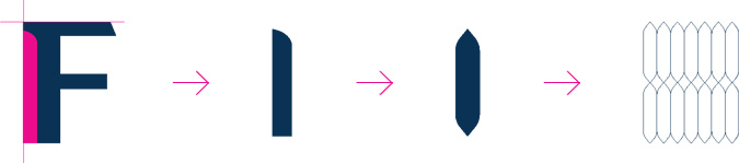
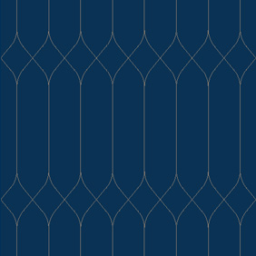
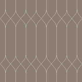
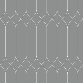
Graphic Motifs
Graphic motifs, the visual language that speaks to unique brand identity,
are designed based on the figurative characteristics of FORENA.
-

-
A-1

-
A-2

-
A-3

-
A-4

The patterns are developed from the visual characteristics of the brand mark and emphasize the brand image.
Pattern A can be used with its standardized color scheme only, and the standard module can be expanded or minimized in respect to ratio and/or
whether it is being expanded vertically or laterally. -
-

-
B-1

-
B-2

-
B-3

-
B-4

The patterns are developed from the visual characteristics of the brand mark and emphasize the brand image.
Pattern B can be used with its standardized color scheme only, and the standard module can be expanded or minimized in respect to ratio and/or
whether it is being expanded laterally. -
-
-
C-1

-
C-2

-
C-3

-
C-4

The patterns are developed from the visual characteristics of the brand mark and emphasize the brand image.
Pattern C can be used with its standardized color scheme only, and the standard module can be expanded or minimized in respect to ratio and/or
whether it is being expanded vertically or laterally. -
-
-
D-1
-
D-2
-
D-3

-
D-4
The patterns are developed from the visual characteristics of the brand mark and emphasize the brand image.
Pattern D can be used with its standardized color scheme only, and the standard module can be expanded or minimized in respect to ratio and/or
whether it is being expanded vertically or laterally. -